Quickstart
GoldenViz can be used in three practical ways:
Display a report for a specific figure with
gv.check(fig).Display a report for the current Matplotlib figure with
gv.check_current().Return structured Python results with
gv.analyze(fig).
In notebooks, you can also enable automatic mode with gv.auto() so reports
appear below charts as you create them.
The 25 GoldenViz rules
GoldenViz checks Matplotlib charts against 25 practical visualization rules. The rule set is inspired by The 25 Golden Rules of Data Viz by Wajdi Ben Saad.
The rules are grouped into three families:
Completeness: the chart contains enough information to be understood.Readability: the chart can be read and compared without unnecessary effort.Integrity: the chart avoids misleading scale, encoding, or comparison choices.
| Family | Rule | What GoldenViz checks |
|---|---|---|
| Completeness | 1 - Clear title | Checks whether the chart has a meaningful title that names the subject, metric, period, or main message, instead of leaving the reader to guess what the figure represents. |
| 2 - Axis labels | Checks whether the x-axis and y-axis are labeled clearly enough to explain what the values or categories mean, including units when they are needed. | |
| 3 - Units and scale clarity | Checks whether numeric labels communicate scale and units, such as percentages, currency, counts, millions, or other measurement context. | |
| 4 - Legend clarity | Checks whether multi-series charts identify each series clearly, especially when several lines, colors, or categories appear in the same axis. | |
| 5 - Annotation context | Checks whether charts with important changes, many marks, or obvious events provide enough annotation or context for the reader to understand the takeaway. | |
| 6 - Uncertainty cues | Checks whether estimates or trends that may involve variability include uncertainty cues, such as error bars, bands, intervals, or similar context. | |
| Readability | 7 - Readable labels and ticks | Checks for overlapping, crowded, tiny, excessive, or awkwardly rotated tick labels that make the chart difficult to read. |
| 8 - Color accessibility | Checks whether color choices are likely to remain distinguishable, especially for categorical charts with many colors or low-contrast palettes. | |
| 9 - Direct labeling | Checks whether line charts or multi-series charts could be easier to read with direct labels instead of forcing repeated lookup in a legend. | |
| 10 - Avoid chartjunk | Checks for visual clutter such as heavy grids, excessive frames, decorative styling, or non-data ink that competes with the data. | |
| 11 - Too many categories | Checks whether categorical charts contain too many groups to compare comfortably, suggesting grouping, filtering, or focusing the view. | |
| 12 - Sort categorical bars | Checks whether bar charts with categorical values are ordered in a way that supports comparison, ranking, or scanning. | |
| 13 - Scatter overplotting | Checks whether scatter points overlap or repeat enough to hide density, suggesting transparency, aggregation, jitter, or size encoding. | |
| 14 - Decimal precision | Checks whether tick labels or annotations use unnecessary decimal precision that adds noise without improving interpretation. | |
| 15 - Date axis formatting | Checks whether date labels are readable, appropriately spaced, and formatted at a useful time granularity. | |
| 16 - Visual economy | Checks whether the chart uses more visual complexity than needed, such as redundant marks, excessive categories, or unnecessary encodings. | |
| Integrity | 17 - Appropriate scale | Checks whether scales are valid and honest, especially whether bar charts start from zero unless a truncated baseline is clearly justified. |
| 18 - Chart type | Checks whether the chosen chart type fits the data structure, such as avoiding line charts for unordered categories. | |
| 19 - Color map quality | Checks whether continuous color maps are perceptually reasonable and not misleading, especially avoiding problematic rainbow-style maps. | |
| 20 - Avoid dual axes | Checks for twin-axis charts that can imply false relationships because two unrelated scales are plotted together. | |
| 21 - Area baseline | Checks whether filled area charts use an honest baseline, because area size visually implies magnitude. | |
| 22 - Aspect ratio sanity | Checks whether the figure shape is extremely compressed or stretched in a way that exaggerates or hides trends. | |
| 23 - Histogram bin quality | Checks whether histogram bin choices are too coarse or too dense to show the distribution shape honestly. | |
| 24 - Category color consistency | Checks whether the same category keeps the same color across marks, avoiding accidental color/category contradictions. | |
| 25 - Diverging zero reference | Checks whether charts with positive and negative values make the zero reference clear enough for honest comparison. |
Manual report for a figure
Use gv.check(fig) when you have a Matplotlib figure object and want to show
the GoldenViz report immediately.
import matplotlib.pyplot as plt
import GoldenViz as gv

fig, ax = plt.subplots()
ax.plot([2021, 2022, 2023], [10, 14, 13])
ax.set_title("Revenue trend by year")
ax.set_xlabel("Year")
ax.set_ylabel("Revenue (M EUR)")

gv.check(fig)
This is the safest starting point because you explicitly choose which figure GoldenViz should inspect.
Manual report for the current chart
Use gv.check_current() when you just created a chart and want GoldenViz to
inspect the current active Matplotlib figure.
import matplotlib.pyplot as plt
import GoldenViz as gv

plt.plot([2021, 2022, 2023], [10, 14, 13])
plt.title("Revenue trend by year")
plt.xlabel("Year")
plt.ylabel("Revenue (M EUR)")

gv.check_current()
This is convenient in notebooks, but it depends on Matplotlib’s current active figure.
Automatic mode in notebooks
Use gv.auto() when you want GoldenViz to run automatically after charts are
rendered in Jupyter or VS Code notebooks.
import GoldenViz as gv

gv.auto()
After automatic mode is enabled, create charts as usual. GoldenViz displays the chart first, then appends a report below it.
import matplotlib.pyplot as plt

fig, ax = plt.subplots()
ax.plot([2021, 2022, 2023], [10, 14, 13])
ax.set_title("Revenue trend by year")
ax.set_xlabel("Year")
ax.set_ylabel("Revenue (M EUR)")
plt.show()
You can turn automatic mode off when you no longer want reports to appear:
gv.disable()
Structured analysis without display
Use gv.analyze(fig) when you want data you can inspect in Python instead of
an HTML report.
report = gv.analyze(fig)

print(report.summary_counts)
The returned report contains one analysis section per chart axis. This mode is useful for tests, scripts, dashboards, or custom reporting.
What the report shows
GoldenViz reports are designed to be read from top to bottom:
Start with the summary badges to see how many checks passed, warned, or failed.
Read
Needs attentionfirst. These are the rules to fix before sharing the chart.Use the
Assessmentcolumn as the explanation and quick repair suggestion.Open
Passing checksonly when you want to see what already looks good.
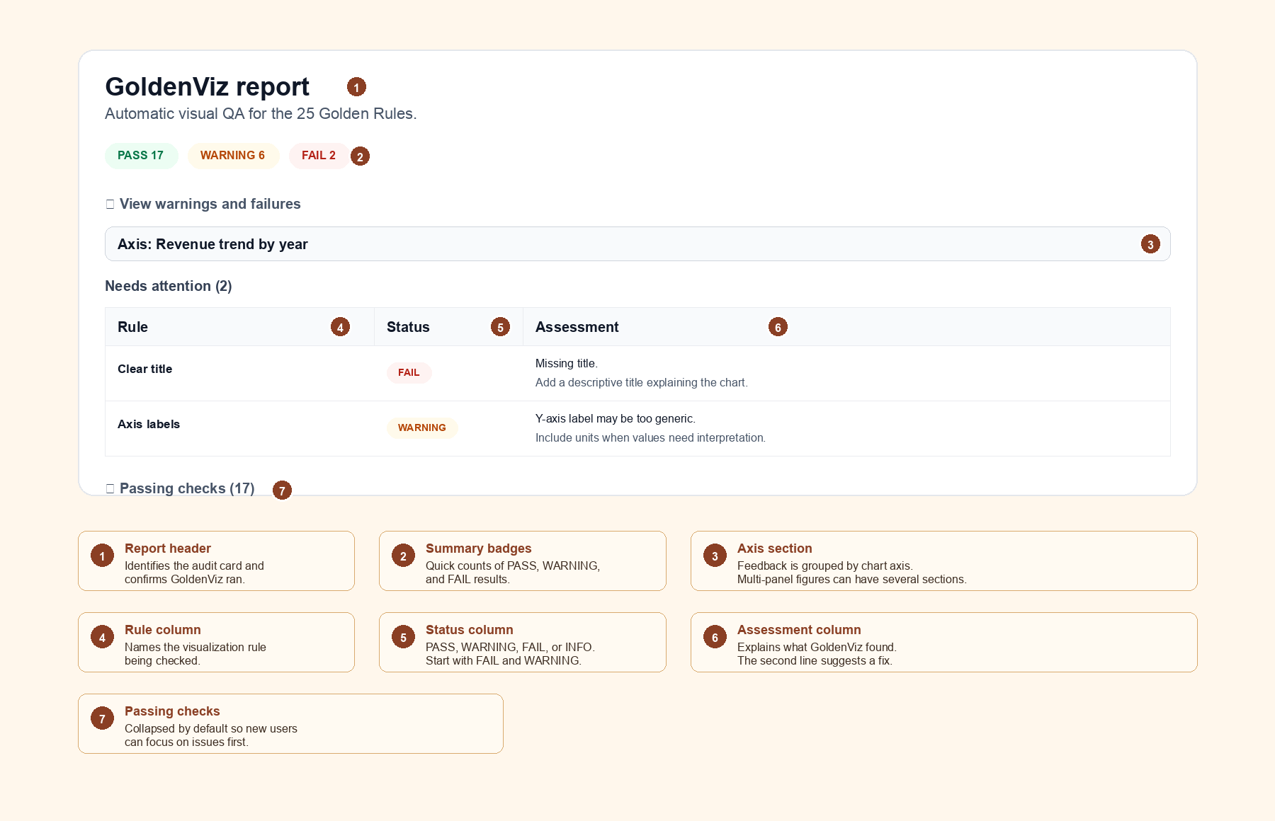
Report columns
Area |
What it means |
How to use it |
|---|---|---|
Rule |
The visualization rule being checked. |
Use it to identify the type of issue, such as title, axis labels, scale, or color. |
Status |
The result of the check: |
Fix |
Assessment |
The message explaining what GoldenViz found. |
Read the first line for the problem and the second line for a suggested improvement. |
Passing checks |
Rules that did not raise a concern. |
These are collapsed so beginners can focus on problems first. |