GoldenViz examples: 25 rules
Each example is a complete, standalone Matplotlib snippet. The good-chart code highlights the lines that were added or corrected.
Installation check output
This cell reproduces the installation smoke test. The first output is the Matplotlib chart; the second output is the GoldenViz report embedded as HTML.
[1]:
import matplotlib.pyplot as plt
from IPython.display import HTML, display
from pathlib import Path
import GoldenViz as gv

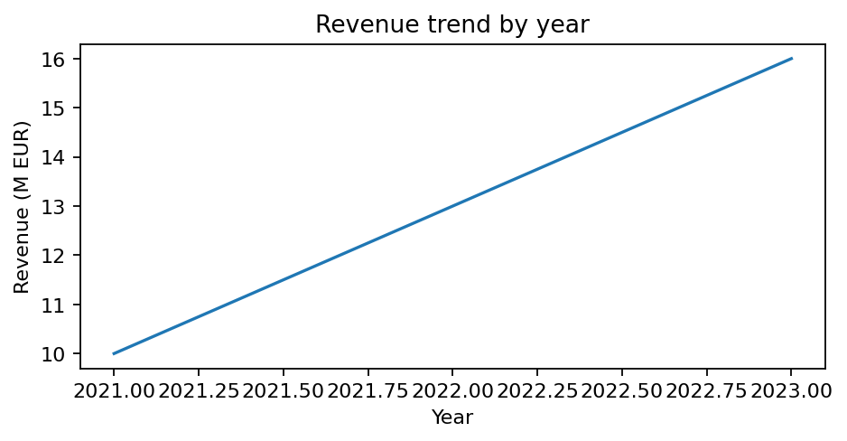
fig, ax = plt.subplots(figsize=(6, 3.2))
ax.plot([2021, 2022, 2023], [10, 13, 16])
ax.set_title("Revenue trend by year")
ax.set_xlabel("Year")
ax.set_ylabel("Revenue (M EUR)")

# The chart output appears first.
display(fig)

# GoldenViz analyzes the figure; the HTML report below is embedded in this notebook.
report = gv.analyze(fig)
report_html = Path("_static/goldenviz_installation_check_report.html")
if not report_html.exists():
    report_html = Path("docs/_static/goldenviz_installation_check_report.html")
display(HTML(report_html.read_text(encoding="utf-8")))
plt.close(fig)
View warnings and failures
Passing checks (25)
| Rule | Status | Assessment |
|---|---|---|
| Clear title | PASS |
Title detected: 'Revenue trend by year'.
|
| Axis labels | PASS |
Both x-axis and y-axis labels are present.
|
| Units and scale clarity | PASS |
Numeric labels include detectable units or scale where applicable.
|
| Legend clarity | PASS |
No obvious legend clarity issue detected.
|
| Annotation context | PASS |
No obvious annotation context issue detected.
Revenue trend by year
|
| Uncertainty cues | PASS |
No uncertainty cue issue detected.
Revenue trend by year
|
| Readable labels and ticks | PASS |
No obvious readability issue detected.
|
| Color accessibility | PASS |
No obvious color accessibility issue detected.
|
| Direct labeling | PASS |
No direct-labeling opportunity detected.
|
| Avoid chartjunk | PASS |
No obvious chartjunk issue detected.
Revenue trend by year
|
| Too many categories | PASS |
Category count appears manageable.
Revenue trend by year
|
| Sort categorical bars | PASS |
No categorical bar sorting issue detected.
Revenue trend by year
|
| Scatter overplotting | PASS |
No scatter overplotting issue detected.
Revenue trend by year
|
| Decimal precision | PASS |
Tick precision appears readable.
Revenue trend by year
|
| Date axis formatting | PASS |
No obvious date-axis formatting issue detected.
Revenue trend by year
|
| Visual economy | PASS |
Chart appears visually economical.
Revenue trend by year
|
| Appropriate scale | PASS |
No obvious scale issue detected.
|
| Chart type | PASS |
Detected chart type: line.
|
| Color map quality | PASS |
No problematic color map detected.
|
| Avoid dual axes | PASS |
No dual-axis layout detected.
Revenue trend by year
|
| Area baseline | PASS |
No area baseline issue detected.
Revenue trend by year
|
| Aspect ratio sanity | PASS |
Figure aspect ratio appears reasonable.
Revenue trend by year
|
| Histogram bin quality | PASS |
No histogram bin issue detected.
Revenue trend by year
|
| Category color consistency | PASS |
No category color issue detected.
Revenue trend by year
|
| Diverging zero reference | PASS |
No diverging zero-reference issue detected.
Revenue trend by year
|
Completeness rules
Rules 1-6 check whether the chart contains enough information to be understood on its own.
Rule 1 · Clear title
A title should tell the reader what the chart is about before they inspect the marks.
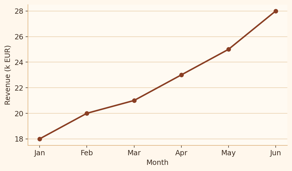
Bad chart code
import matplotlib.pyplot as plt

months = ["Jan", "Feb", "Mar", "Apr", "May", "Jun"]
revenue = [18, 20, 21, 23, 25, 28]

fig, ax = plt.subplots(figsize=(6.4, 3.8))
ax.plot(months, revenue, marker="o")
ax.set_xlabel("Month")
ax.set_ylabel("Revenue (k EUR)")
plt.show()
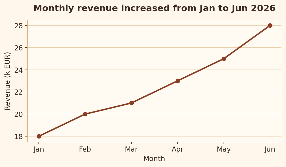
Good chart code
import matplotlib.pyplot as plt

months = ["Jan", "Feb", "Mar", "Apr", "May", "Jun"]
revenue = [18, 20, 21, 23, 25, 28]

fig, ax = plt.subplots(figsize=(6.4, 3.8))
ax.plot(months, revenue, marker="o")
ax.set_title("Monthly revenue increased from Jan to Jun 2026")
ax.set_xlabel("Month")
ax.set_ylabel("Revenue (k EUR)")
plt.show()
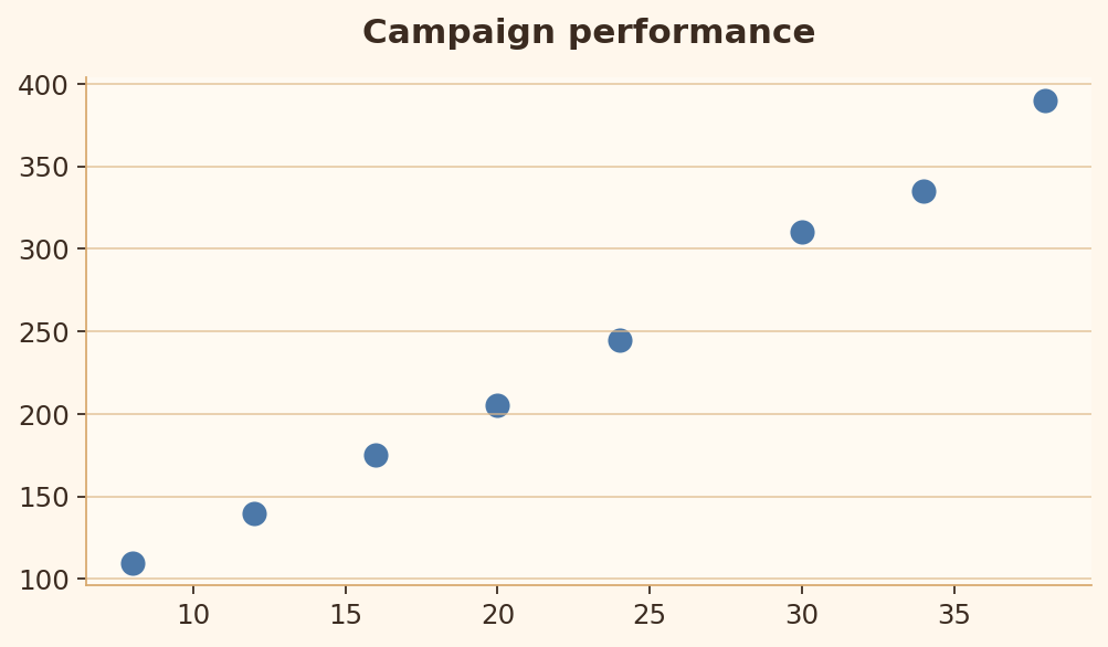
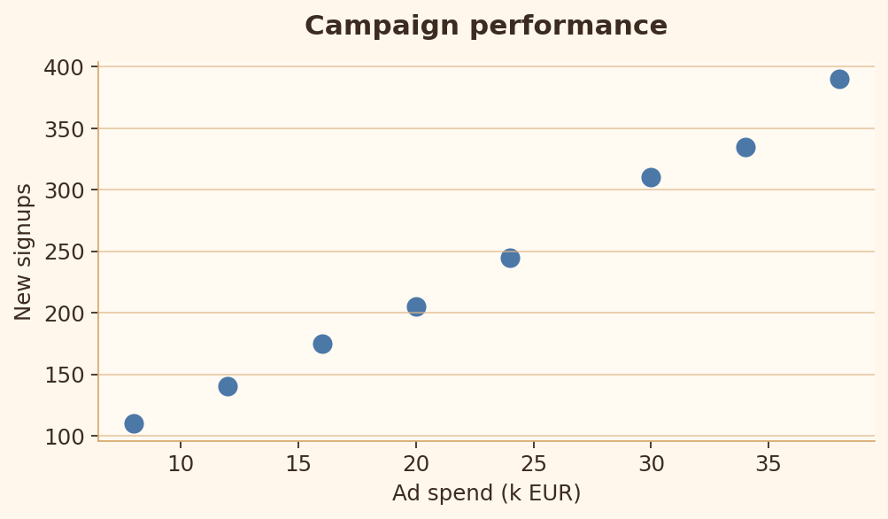
Rule 2 · Axis labels
Axis labels and units make the measurement unambiguous.
Bad chart code
import matplotlib.pyplot as plt

ad_spend = [8, 12, 16, 20, 24, 30, 34, 38]
signups = [110, 140, 175, 205, 245, 310, 335, 390]

fig, ax = plt.subplots(figsize=(6.4, 3.8))
ax.scatter(ad_spend, signups)
ax.set_title("Campaign performance")
plt.show()
Good chart code
import matplotlib.pyplot as plt

ad_spend = [8, 12, 16, 20, 24, 30, 34, 38]
signups = [110, 140, 175, 205, 245, 310, 335, 390]

fig, ax = plt.subplots(figsize=(6.4, 3.8))
ax.scatter(ad_spend, signups)
ax.set_title("Campaign performance")
ax.set_xlabel("Ad spend (k EUR)")
ax.set_ylabel("New signups")
plt.show()
Rule 3 · Units and scale clarity
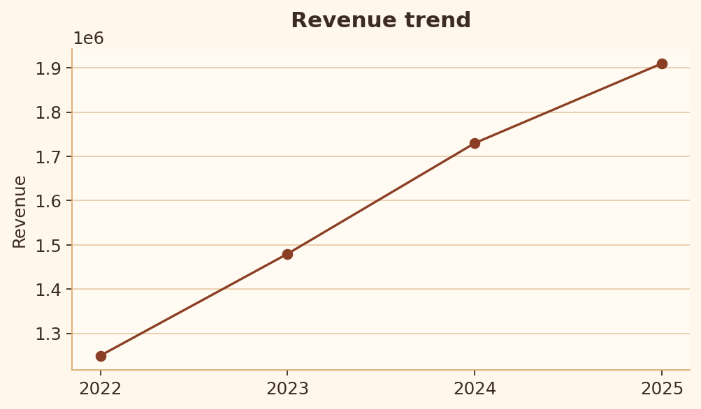
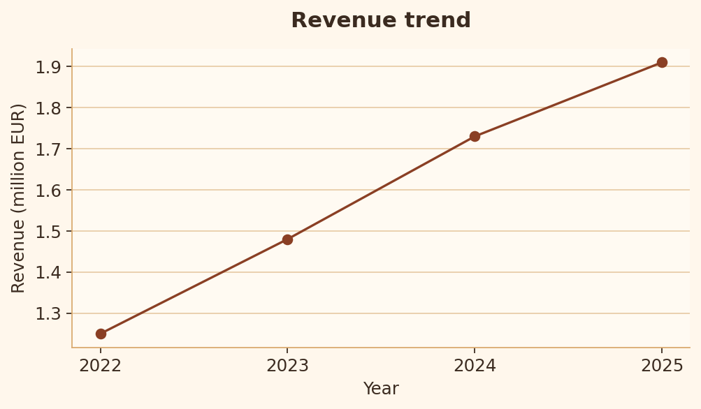
Large values should be scaled and labeled so the reader knows what the numbers mean.
Bad chart code
import matplotlib.pyplot as plt

years = [2022, 2023, 2024, 2025]
revenue = [1250000, 1480000, 1730000, 1910000]

fig, ax = plt.subplots(figsize=(6.4, 3.8))
ax.plot(years, revenue, marker="o")
ax.set_title("Revenue trend")
ax.set_ylabel("Revenue")
plt.show()
Good chart code
import matplotlib.pyplot as plt

years = [2022, 2023, 2024, 2025]
revenue = [1250000, 1480000, 1730000, 1910000]
revenue_millions = [value / 1_000_000 for value in revenue]

fig, ax = plt.subplots(figsize=(6.4, 3.8))
ax.plot(years, revenue_millions, marker="o")
ax.set_title("Revenue trend")
ax.set_xlabel("Year")
ax.set_ylabel("Revenue (million EUR)")
plt.show()
Rule 4 · Legend clarity
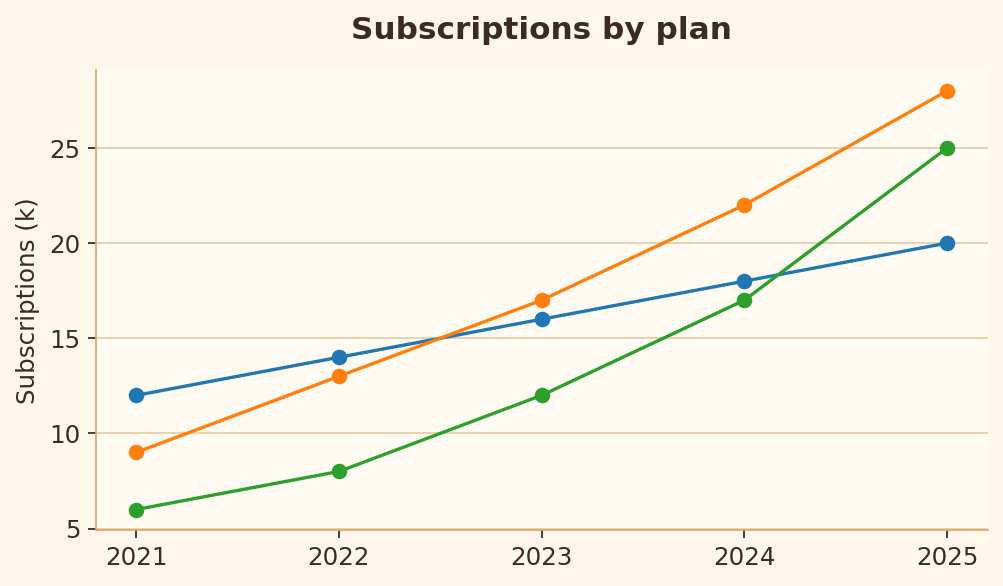
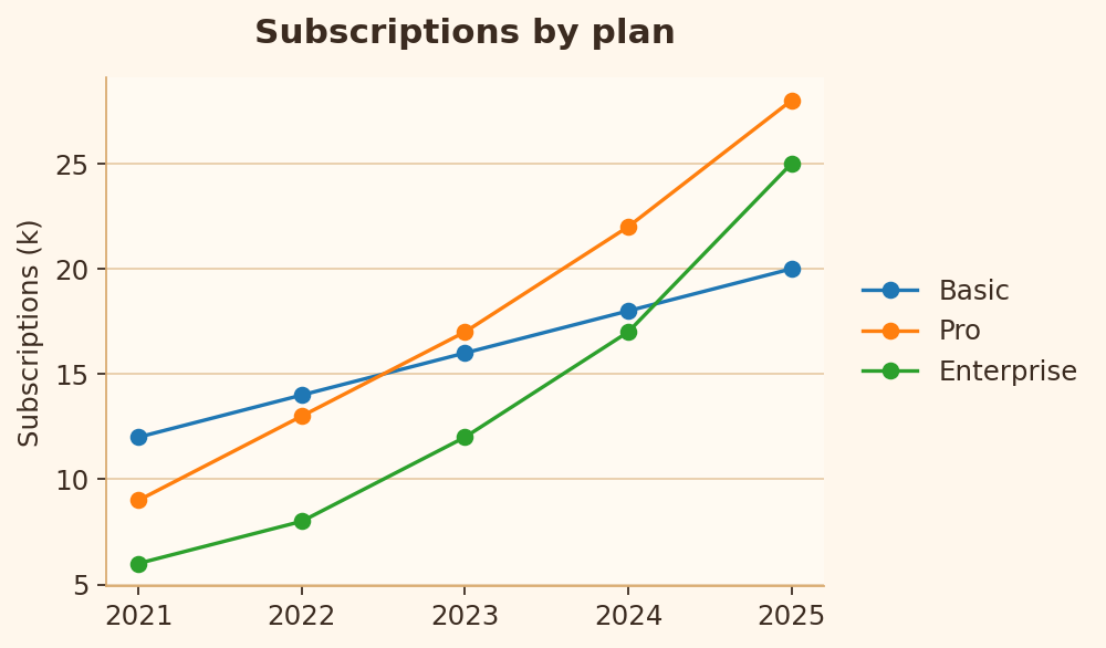
Multiple series need clear labels so readers can identify each line.
Bad chart code
import matplotlib.pyplot as plt

years = [2021, 2022, 2023, 2024, 2025]
series = {
    "Basic": [12, 14, 16, 18, 20],
    "Pro": [9, 13, 17, 22, 28],
    "Enterprise": [6, 8, 12, 17, 25],
}

fig, ax = plt.subplots(figsize=(6.4, 3.8))
for values in series.values():
    ax.plot(years, values, marker="o")
ax.set_title("Subscriptions by plan")
ax.set_ylabel("Subscriptions (k)")
plt.show()
Good chart code
import matplotlib.pyplot as plt

years = [2021, 2022, 2023, 2024, 2025]
series = {
    "Basic": [12, 14, 16, 18, 20],
    "Pro": [9, 13, 17, 22, 28],
    "Enterprise": [6, 8, 12, 17, 25],
}

fig, ax = plt.subplots(figsize=(6.4, 3.8))
for label, values in series.items():
    ax.plot(years, values, marker="o", label=label)
ax.legend(loc="center left", bbox_to_anchor=(1.02, 0.5))
ax.set_title("Subscriptions by plan")
ax.set_ylabel("Subscriptions (k)")
plt.show()
Rule 5 · Annotation context
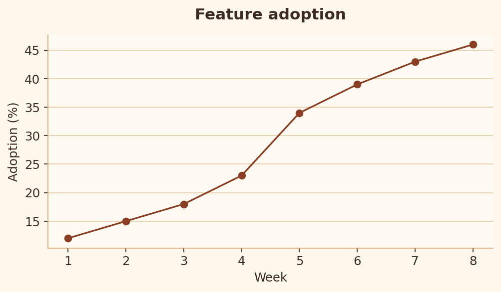
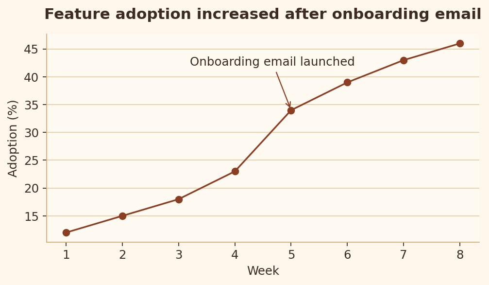
Important events or takeaways should be visible when they explain the pattern.
Bad chart code
import matplotlib.pyplot as plt

weeks = [1, 2, 3, 4, 5, 6, 7, 8]
adoption = [12, 15, 18, 23, 34, 39, 43, 46]

fig, ax = plt.subplots(figsize=(6.4, 3.8))
ax.plot(weeks, adoption, marker="o")
ax.set_title("Feature adoption")
ax.set_xlabel("Week")
ax.set_ylabel("Adoption (%)")
plt.show()
Good chart code
import matplotlib.pyplot as plt

weeks = [1, 2, 3, 4, 5, 6, 7, 8]
adoption = [12, 15, 18, 23, 34, 39, 43, 46]

fig, ax = plt.subplots(figsize=(6.4, 3.8))
ax.plot(weeks, adoption, marker="o")
ax.annotate("Onboarding email launched", xy=(5, 34), xytext=(3.2, 42), arrowprops={"arrowstyle": "->"})
ax.set_title("Feature adoption increased after onboarding email")
ax.set_xlabel("Week")
ax.set_ylabel("Adoption (%)")
plt.show()
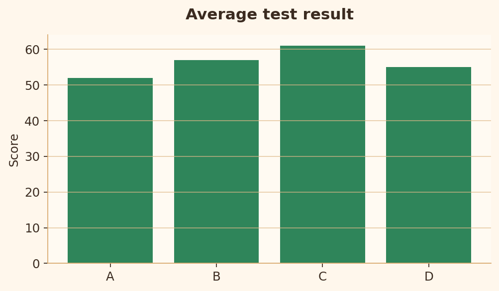
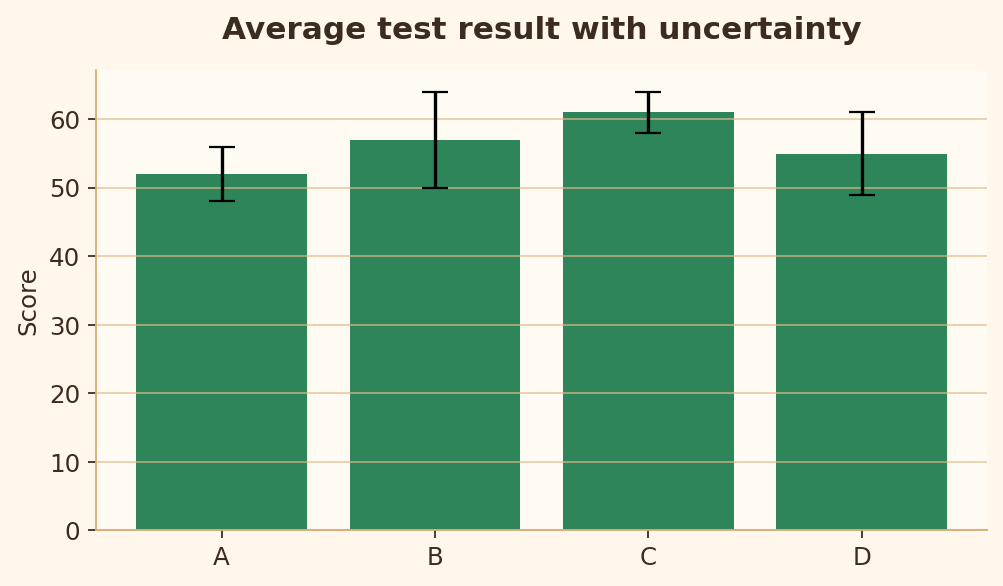
Rule 6 · Uncertainty cues
Estimates should show uncertainty when the uncertainty matters.
Bad chart code
import matplotlib.pyplot as plt

groups = ["A", "B", "C", "D"]
mean = [52, 57, 61, 55]
error = [4, 7, 3, 6]

fig, ax = plt.subplots(figsize=(6.4, 3.8))
ax.bar(groups, mean)
ax.set_title("Average test result")
ax.set_ylabel("Score")
plt.show()
Good chart code
import matplotlib.pyplot as plt

groups = ["A", "B", "C", "D"]
mean = [52, 57, 61, 55]
error = [4, 7, 3, 6]

fig, ax = plt.subplots(figsize=(6.4, 3.8))
ax.bar(groups, mean, yerr=error, capsize=6)
ax.set_title("Average test result with uncertainty")
ax.set_ylabel("Score")
plt.show()
Readability rules
Rules 7-16 check whether the chart can be read, scanned, and compared without unnecessary effort.
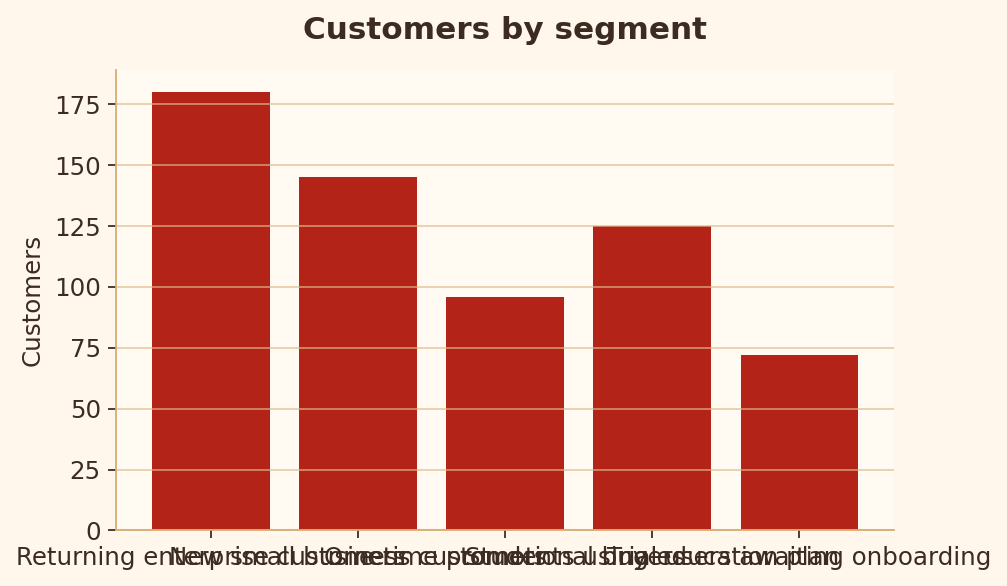
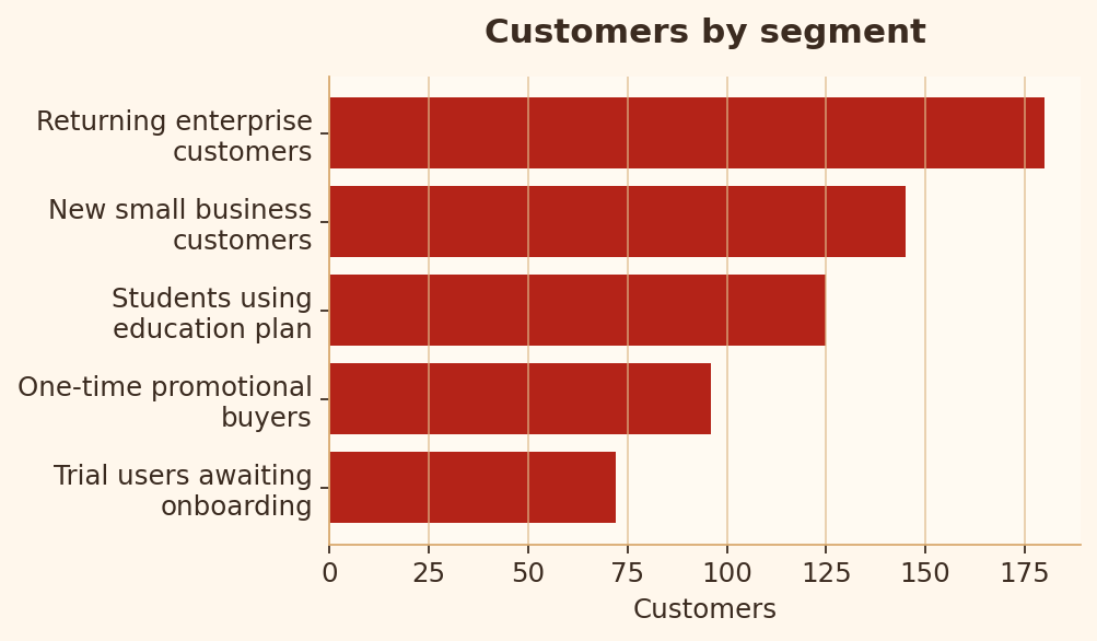
Rule 7 · Readable labels
Long labels should not collide or force the reader to decode a crowded axis.
Bad chart code
import matplotlib.pyplot as plt

segments = [
    "Returning enterprise customers",
    "New small business customers",
    "One-time promotional buyers",
    "Students using education plan",
    "Trial users awaiting onboarding",
]
counts = [180, 145, 96, 125, 72]

fig, ax = plt.subplots(figsize=(6.4, 3.8))
ax.bar(segments, counts)
ax.set_title("Customers by segment")
plt.show()
Good chart code
import matplotlib.pyplot as plt
import textwrap

segments = [
    "Returning enterprise customers",
    "New small business customers",
    "One-time promotional buyers",
    "Students using education plan",
    "Trial users awaiting onboarding",
]
counts = [180, 145, 96, 125, 72]
labels = [textwrap.fill(s, 22) for s in segments]
pairs = sorted(zip(counts, labels))

fig, ax = plt.subplots(figsize=(6.4, 3.8))
ax.barh([label for _, label in pairs], [count for count, _ in pairs])
ax.set_title("Customers by segment")
ax.set_xlabel("Customers")
plt.show()
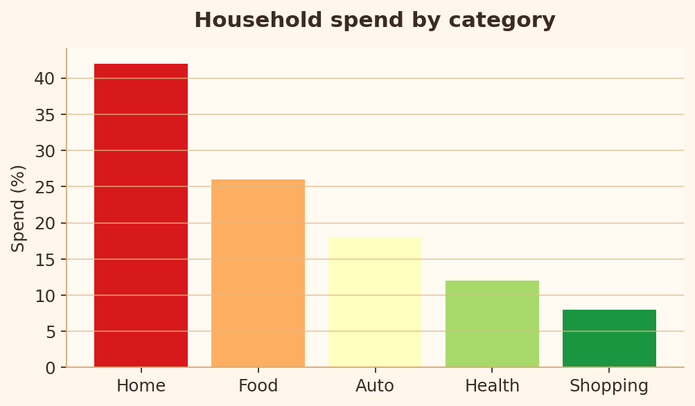
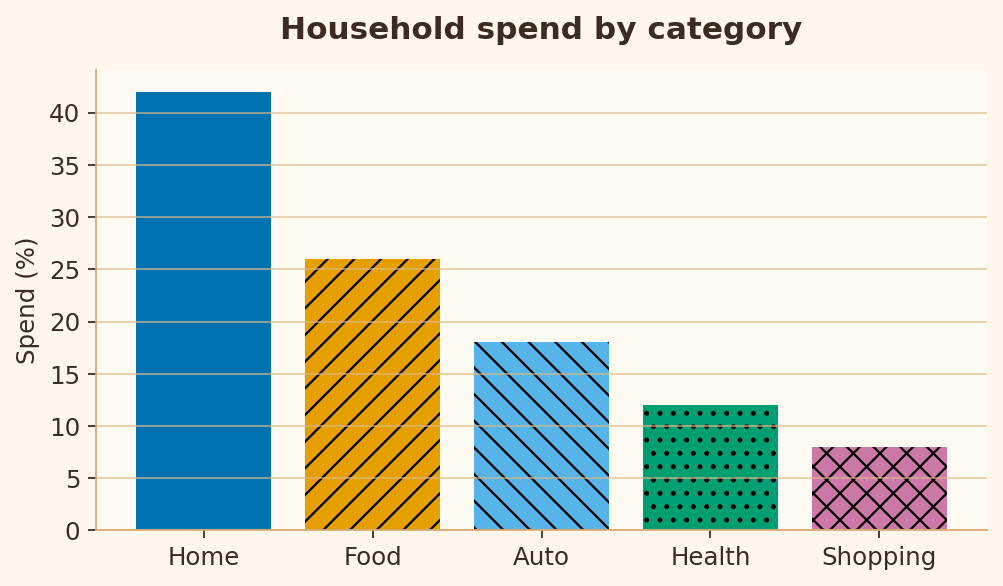
Rule 8 · Color accessibility
Charts should remain readable for people with color-vision deficiencies.
Bad chart code
import matplotlib.pyplot as plt

segments = ["Home", "Food", "Auto", "Health", "Shopping"]
spend = [42, 26, 18, 12, 8]
colors = ["#d7191c", "#fdae61", "#ffffbf", "#a6d96a", "#1a9641"]

fig, ax = plt.subplots(figsize=(6.4, 3.8))
ax.bar(segments, spend, color=colors)
ax.set_title("Household spend by category")
ax.set_ylabel("Spend (%)")
plt.show()
Good chart code
import matplotlib.pyplot as plt

segments = ["Home", "Food", "Auto", "Health", "Shopping"]
spend = [42, 26, 18, 12, 8]
colors = ["#0072B2", "#E69F00", "#56B4E9", "#009E73", "#CC79A7"]
hatches = ["", "//", "\\", "..", "xx"]

fig, ax = plt.subplots(figsize=(6.4, 3.8))
bars = ax.bar(segments, spend, color=colors)
for bar, hatch in zip(bars, hatches):
    bar.set_hatch(hatch)
ax.set_title("Household spend by category")
ax.set_ylabel("Spend (%)")
plt.show()
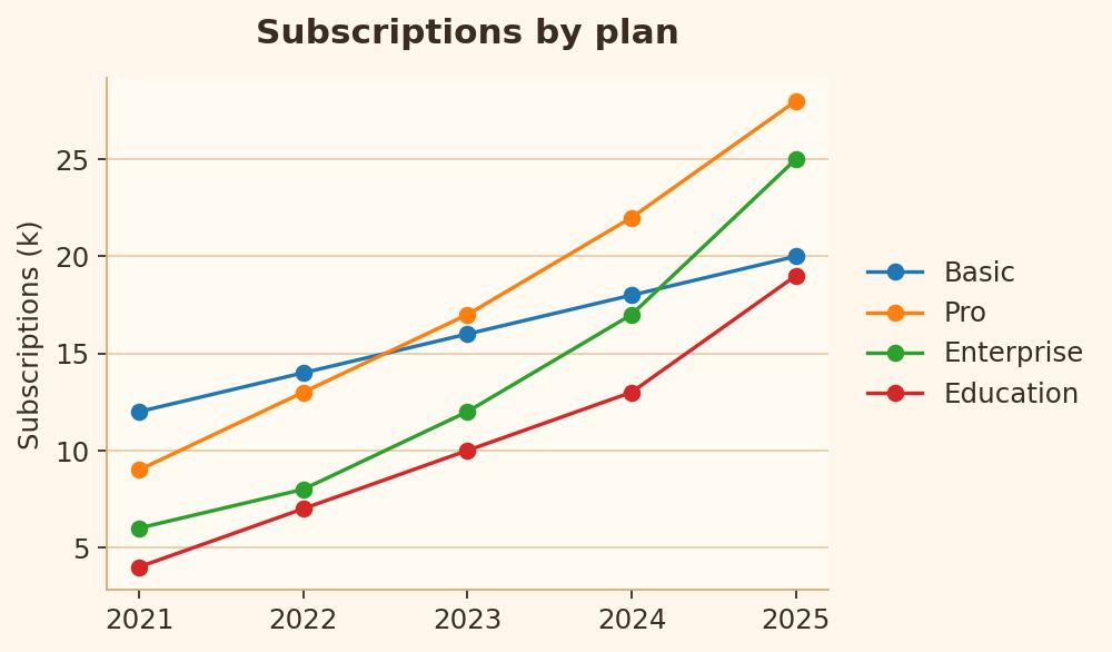
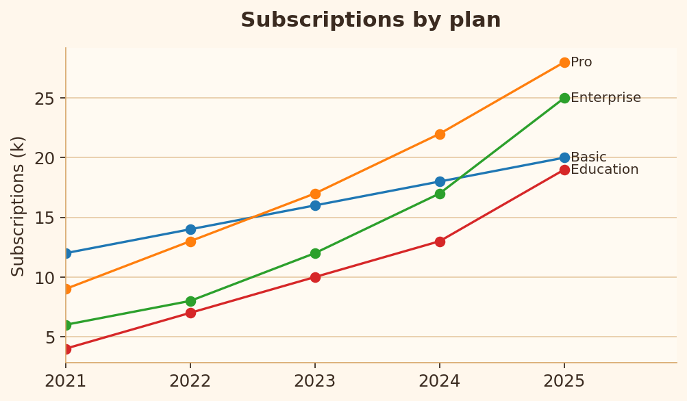
Rule 9 · Direct labeling
When lines are easy to label directly, readers should not have to bounce between the plot and legend.
Bad chart code
import matplotlib.pyplot as plt

years = [2021, 2022, 2023, 2024, 2025]
series = {
    "Basic": [12, 14, 16, 18, 20],
    "Pro": [9, 13, 17, 22, 28],
    "Enterprise": [6, 8, 12, 17, 25],
    "Education": [4, 7, 10, 13, 19],
}

fig, ax = plt.subplots(figsize=(6.4, 3.8))
for label, values in series.items():
    ax.plot(years, values, marker="o", label=label)
ax.legend()
ax.set_title("Subscriptions by plan")
ax.set_ylabel("Subscriptions (k)")
plt.show()
Good chart code
import matplotlib.pyplot as plt

years = [2021, 2022, 2023, 2024, 2025]
series = {
    "Basic": [12, 14, 16, 18, 20],
    "Pro": [9, 13, 17, 22, 28],
    "Enterprise": [6, 8, 12, 17, 25],
    "Education": [4, 7, 10, 13, 19],
}

fig, ax = plt.subplots(figsize=(6.4, 3.8))
for label, values in series.items():
    ax.plot(years, values, marker="o")
    ax.text(years[-1] + 0.05, values[-1], label, va="center")
ax.set_xlim(2021, 2025.9)
ax.set_title("Subscriptions by plan")
ax.set_ylabel("Subscriptions (k)")
plt.show()
Rule 10 · Avoid chartjunk
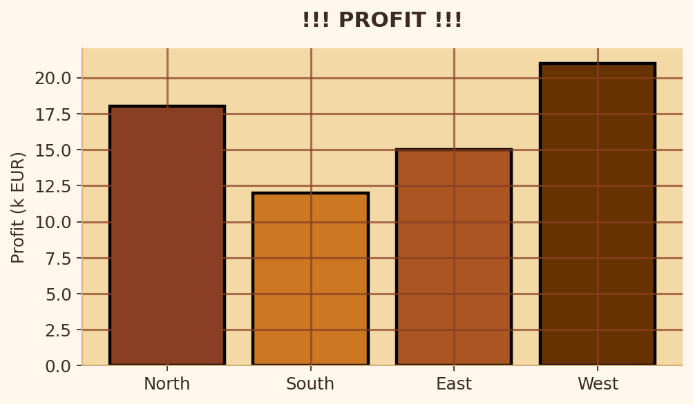
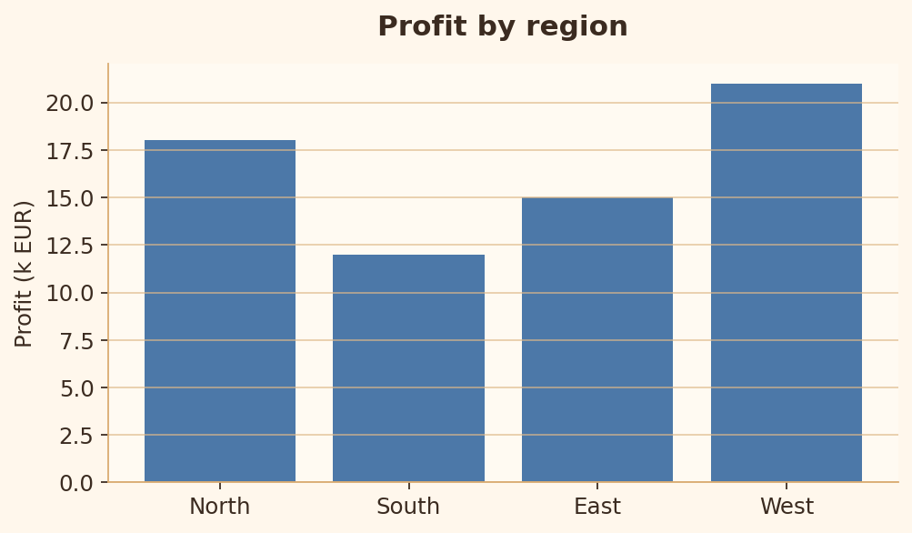
Decoration should not compete with the data.
Bad chart code
import matplotlib.pyplot as plt

regions = ["North", "South", "East", "West"]
profit = [18, 12, 15, 21]

fig, ax = plt.subplots(figsize=(6.4, 3.8))
ax.set_facecolor("#f3d9a5")
ax.bar(regions, profit, edgecolor="black", linewidth=2)
ax.grid(True, axis="both")
ax.set_title("!!! PROFIT !!!")
ax.set_ylabel("Profit (k EUR)")
plt.show()
Good chart code
import matplotlib.pyplot as plt

regions = ["North", "South", "East", "West"]
profit = [18, 12, 15, 21]

fig, ax = plt.subplots(figsize=(6.4, 3.8))
ax.bar(regions, profit)
ax.grid(True, axis="y")
ax.set_title("Profit by region")
ax.set_ylabel("Profit (k EUR)")
plt.show()
Rule 11 · Too many categories
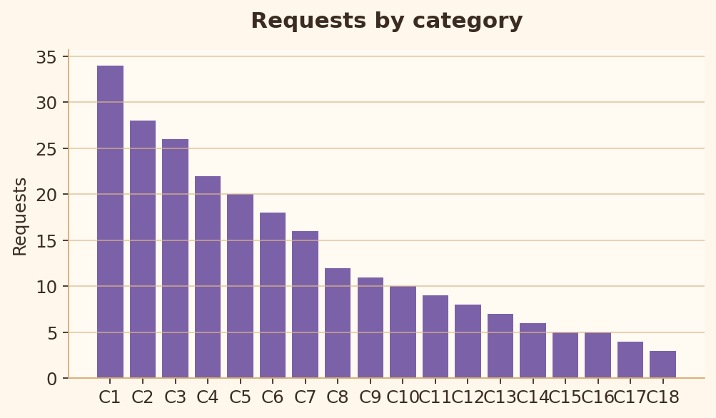
Too many categories make comparison slow and crowded.
Bad chart code
import matplotlib.pyplot as plt

categories = [f"C{i}" for i in range(1, 19)]
values = [34, 28, 26, 22, 20, 18, 16, 12, 11, 10, 9, 8, 7, 6, 5, 5, 4, 3]

fig, ax = plt.subplots(figsize=(6.4, 3.8))
ax.bar(categories, values)
ax.set_title("Requests by category")
ax.set_ylabel("Requests")
plt.show()
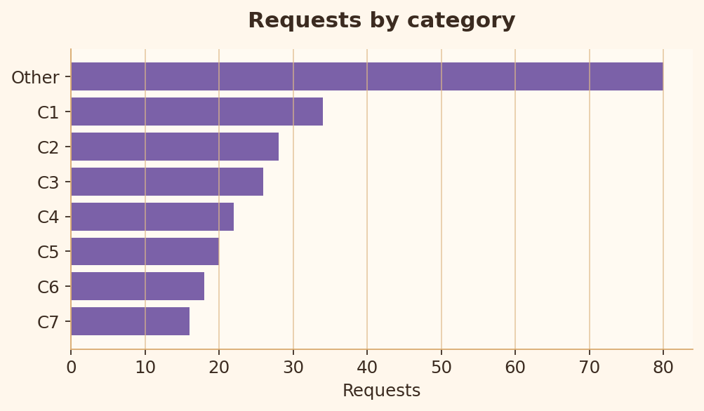
Good chart code
import matplotlib.pyplot as plt

categories = [f"C{i}" for i in range(1, 19)]
values = [34, 28, 26, 22, 20, 18, 16, 12, 11, 10, 9, 8, 7, 6, 5, 5, 4, 3]
top_labels = categories[:7] + ["Other"]
top_values = values[:7] + [sum(values[7:])]
pairs = sorted(zip(top_values, top_labels))

fig, ax = plt.subplots(figsize=(6.4, 3.8))
ax.barh([label for _, label in pairs], [value for value, _ in pairs])
ax.set_title("Requests by category")
ax.set_xlabel("Requests")
plt.show()
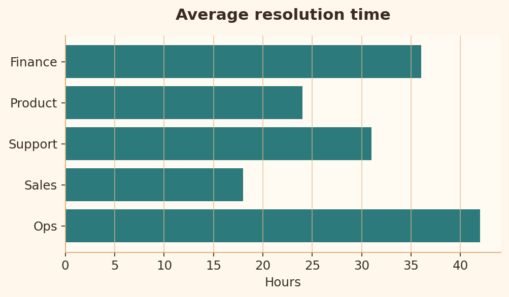
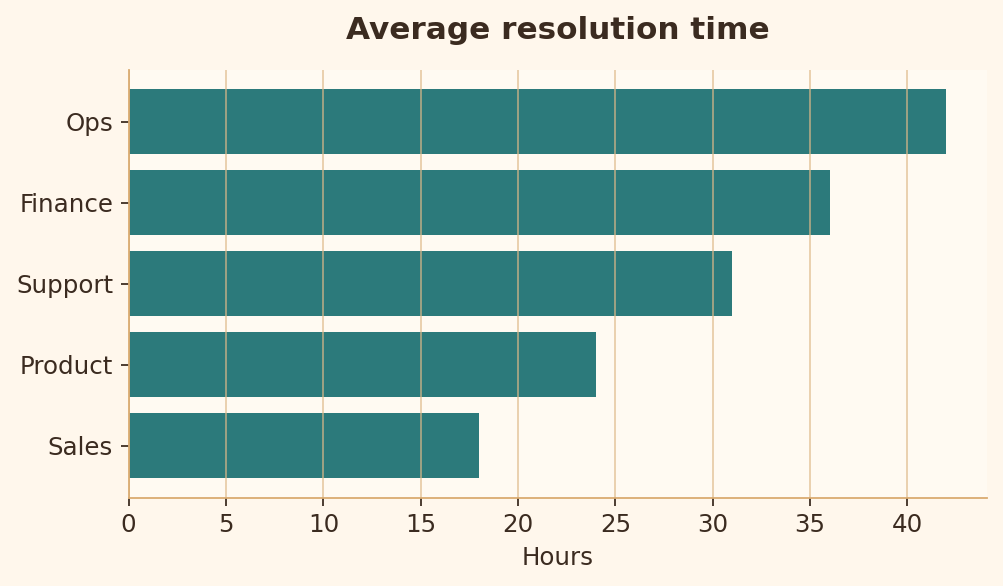
Rule 12 · Sort categorical bars
Sorted bars make ranking and comparison faster.
Bad chart code
import matplotlib.pyplot as plt

teams = ["Ops", "Sales", "Support", "Product", "Finance"]
hours = [42, 18, 31, 24, 36]

fig, ax = plt.subplots(figsize=(6.4, 3.8))
ax.barh(teams, hours)
ax.set_title("Average resolution time")
ax.set_xlabel("Hours")
plt.show()
Good chart code
import matplotlib.pyplot as plt

teams = ["Ops", "Sales", "Support", "Product", "Finance"]
hours = [42, 18, 31, 24, 36]
pairs = sorted(zip(hours, teams))

fig, ax = plt.subplots(figsize=(6.4, 3.8))
ax.barh([team for _, team in pairs], [hour for hour, _ in pairs])
ax.set_title("Average resolution time")
ax.set_xlabel("Hours")
plt.show()
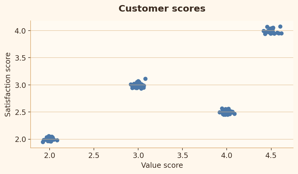
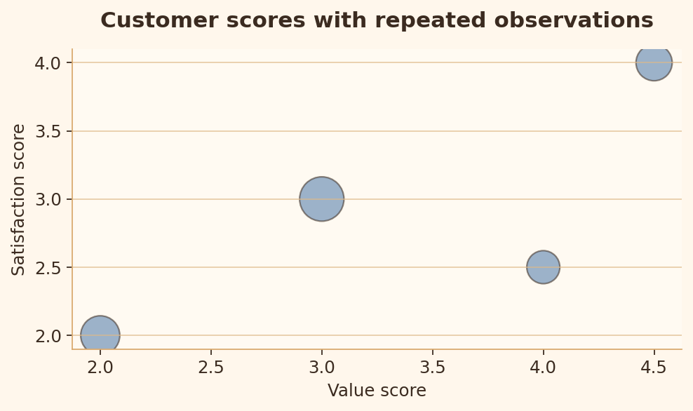
Rule 13 · Scatter overplotting
Repeated or dense points should reveal density instead of hiding it.
Bad chart code
import matplotlib.pyplot as plt
import numpy as np

rng = np.random.default_rng(42)
centers = np.array([[2, 2], [3, 3], [4, 2.5], [4.5, 4]])
points = np.repeat(centers, [35, 45, 25, 30], axis=0)
points = points + rng.normal(0, 0.04, size=(135, 2))

fig, ax = plt.subplots(figsize=(6.4, 3.8))
ax.scatter(points[:, 0], points[:, 1], s=28)
ax.set_xlabel("Value score")
ax.set_ylabel("Satisfaction score")
plt.show()
Good chart code
import matplotlib.pyplot as plt
import numpy as np

centers = np.array([[2, 2], [3, 3], [4, 2.5], [4.5, 4]])
counts = np.array([35, 45, 25, 30])

fig, ax = plt.subplots(figsize=(6.4, 3.8))
ax.scatter(centers[:, 0], centers[:, 1], s=counts * 18, alpha=0.55, edgecolor="black")
ax.set_xlabel("Value score")
ax.set_ylabel("Satisfaction score")
ax.set_title("Point size shows repeated observations")
plt.show()
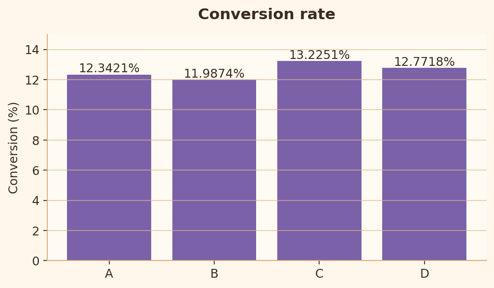
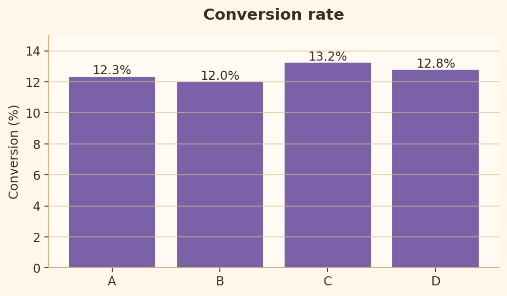
Rule 14 · Decimal precision
Labels should avoid unnecessary decimals that add noise without adding meaning.
Bad chart code
import matplotlib.pyplot as plt

products = ["A", "B", "C", "D"]
conversion = [12.3421, 11.9874, 13.2251, 12.7718]

fig, ax = plt.subplots(figsize=(6.4, 3.8))
bars = ax.bar(products, conversion)
ax.bar_label(bars, fmt="%.4f%%")
ax.set_ylim(0, 15)
ax.set_ylabel("Conversion (%)")
plt.show()
Good chart code
import matplotlib.pyplot as plt

products = ["A", "B", "C", "D"]
conversion = [12.3421, 11.9874, 13.2251, 12.7718]

fig, ax = plt.subplots(figsize=(6.4, 3.8))
bars = ax.bar(products, conversion)
ax.bar_label(bars, fmt="%.1f%%")
ax.set_ylim(0, 15)
ax.set_ylabel("Conversion (%)")
plt.show()
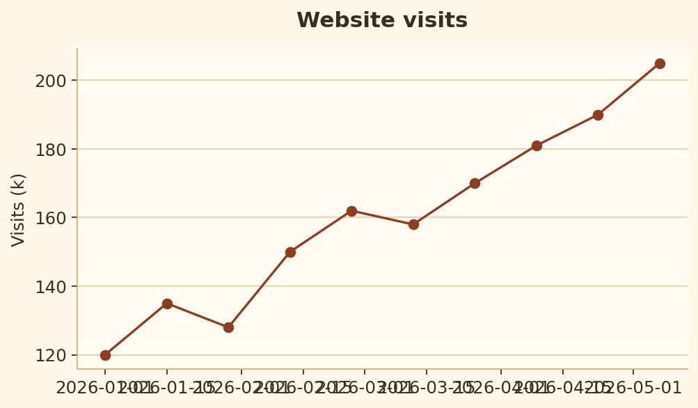
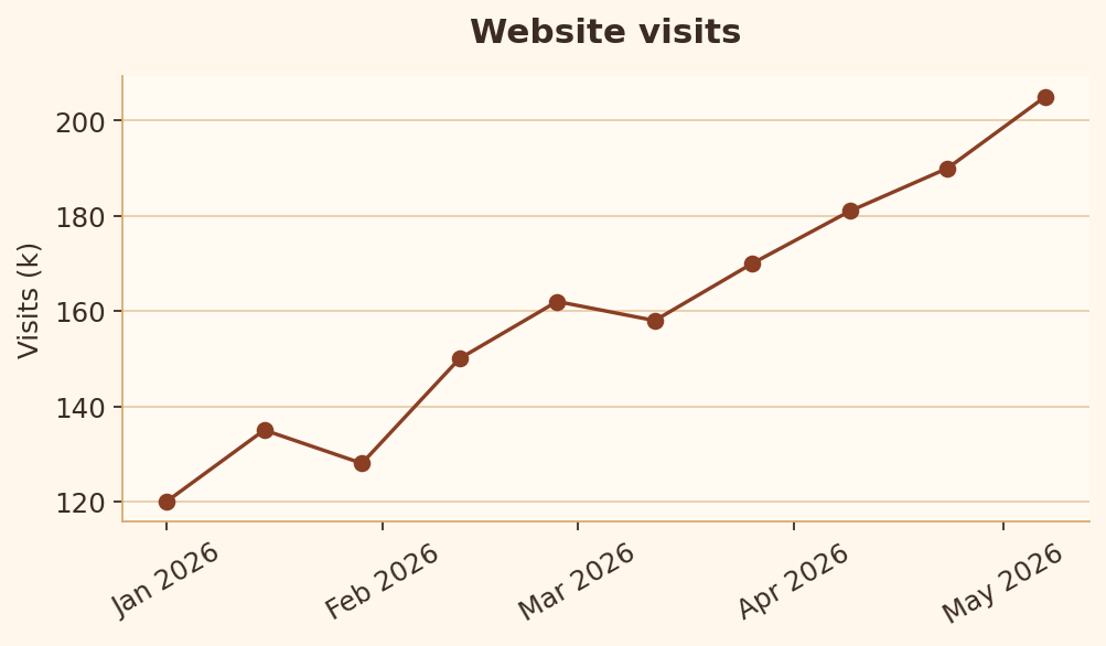
Rule 15 · Date axis formatting
Date ticks should be formatted at a readable interval.
Bad chart code
import matplotlib.pyplot as plt
import numpy as np

dates = [np.datetime64("2026-01-01") + np.timedelta64(i * 14, "D") for i in range(10)]
visits = [120, 135, 128, 150, 162, 158, 170, 181, 190, 205]

fig, ax = plt.subplots(figsize=(6.4, 3.8))
ax.plot(dates, visits, marker="o")
ax.set_title("Website visits")
ax.set_ylabel("Visits (k)")
plt.show()
Good chart code
import matplotlib.pyplot as plt
import matplotlib.dates as mdates
import numpy as np

dates = [np.datetime64("2026-01-01") + np.timedelta64(i * 14, "D") for i in range(10)]
visits = [120, 135, 128, 150, 162, 158, 170, 181, 190, 205]

fig, ax = plt.subplots(figsize=(6.4, 3.8))
ax.plot(dates, visits, marker="o")
ax.set_title("Website visits")
ax.set_ylabel("Visits (k)")
ax.xaxis.set_major_locator(mdates.MonthLocator())
ax.xaxis.set_major_formatter(mdates.DateFormatter("%b %Y"))
ax.tick_params(axis="x", rotation=30)
plt.show()
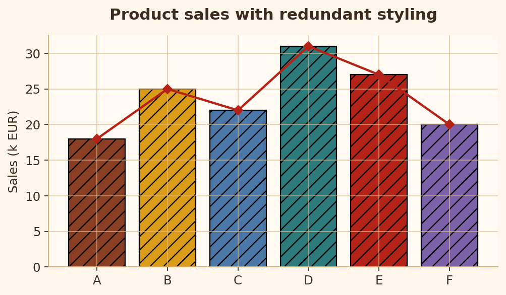
Rule 16 · Visual economy
Use enough visual encoding to explain the data, but avoid redundant styling.
Bad chart code
import matplotlib.pyplot as plt

products = ["A", "B", "C", "D", "E", "F"]
values = [18, 25, 22, 31, 27, 20]

fig, ax = plt.subplots(figsize=(6.4, 3.8))
ax.bar(products, values, hatch="//", edgecolor="black")
ax.plot(products, values, marker="D", color="red")
ax.grid(True, axis="both")
ax.set_title("Product sales with redundant styling")
plt.show()
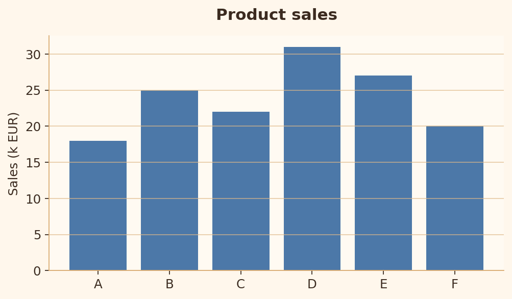
Good chart code
import matplotlib.pyplot as plt

products = ["A", "B", "C", "D", "E", "F"]
values = [18, 25, 22, 31, 27, 20]

fig, ax = plt.subplots(figsize=(6.4, 3.8))
ax.bar(products, values)
ax.grid(True, axis="y")
ax.set_title("Product sales")
ax.set_ylabel("Sales (k EUR)")
plt.show()
Integrity rules
Rules 17-25 check whether the chart avoids misleading scale, encoding, or comparison choices.
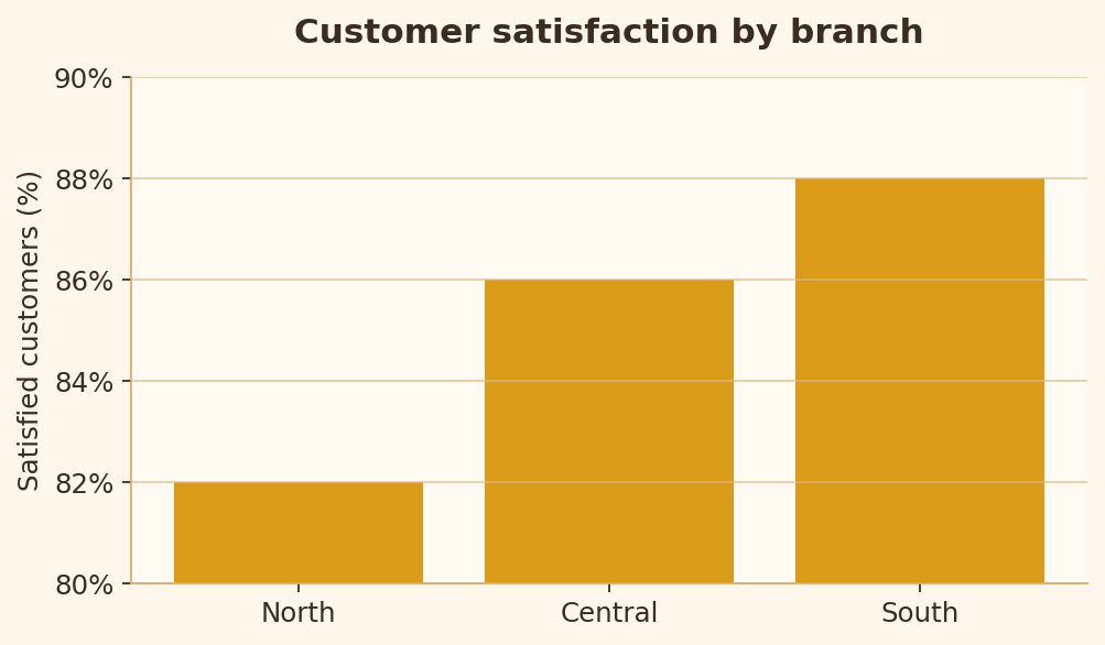
Rule 17 · Appropriate scale
For bars, a truncated baseline can exaggerate small differences.
Bad chart code
import matplotlib.pyplot as plt

branches = ["North", "Central", "South"]
satisfaction = [82, 86, 88]

fig, ax = plt.subplots(figsize=(6.4, 3.8))
ax.bar(branches, satisfaction)
ax.set_ylim(80, 90)
ax.set_title("Customer satisfaction by branch")
ax.set_ylabel("Satisfied customers (%)")
plt.show()
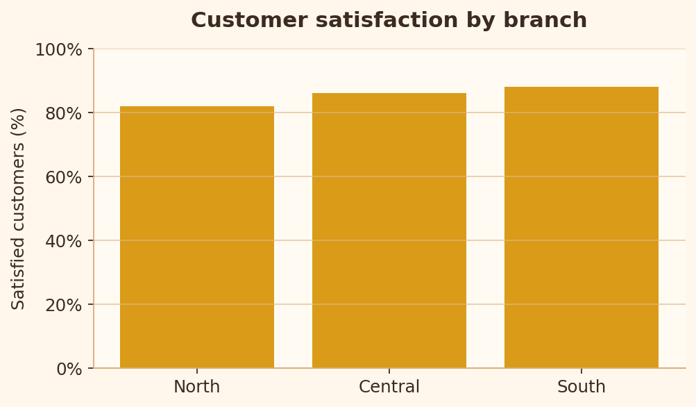
Good chart code
import matplotlib.pyplot as plt

branches = ["North", "Central", "South"]
satisfaction = [82, 86, 88]

fig, ax = plt.subplots(figsize=(6.4, 3.8))
ax.bar(branches, satisfaction)
ax.set_ylim(0, 100)
ax.set_title("Customer satisfaction by branch")
ax.set_ylabel("Satisfied customers (%)")
plt.show()
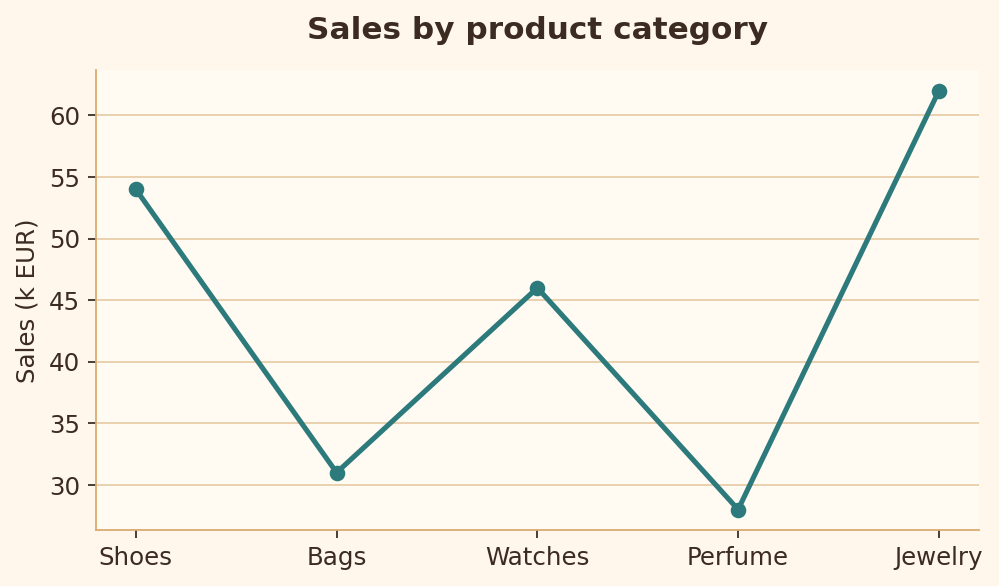
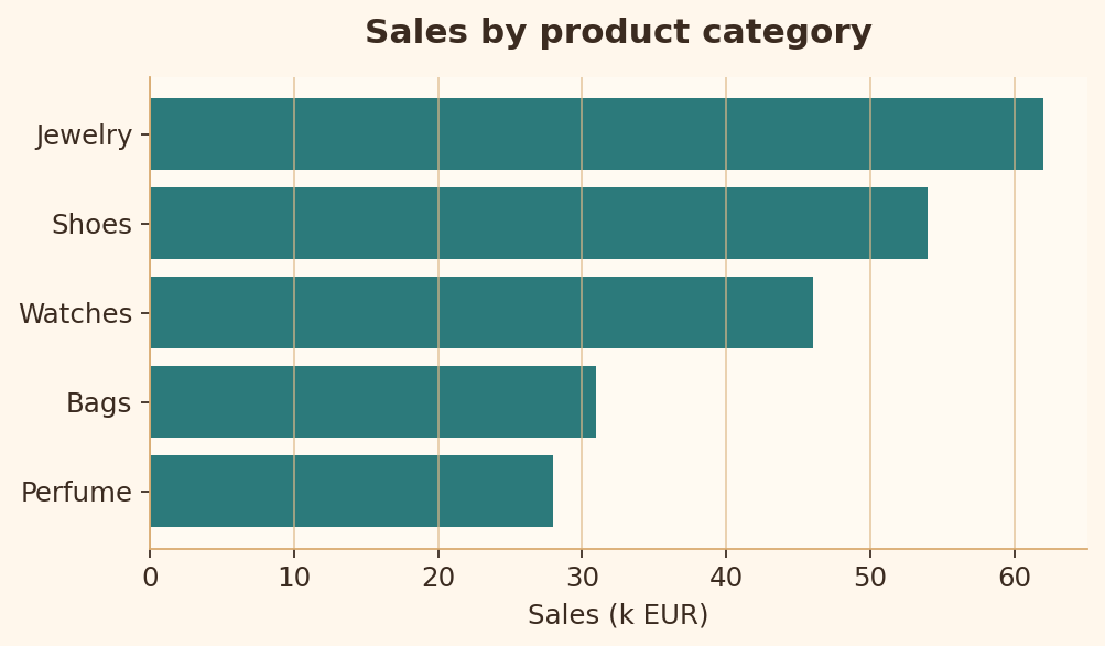
Rule 18 · Suitable chart type
Categorical comparisons are easier to read as bars than as a line that implies sequence.
Bad chart code
import matplotlib.pyplot as plt

products = ["Shoes", "Bags", "Watches", "Perfume", "Jewelry"]
sales = [54, 31, 46, 28, 62]

fig, ax = plt.subplots(figsize=(6.4, 3.8))
ax.plot(products, sales, marker="o")
ax.set_title("Sales by product category")
ax.set_ylabel("Sales (k EUR)")
plt.show()
Good chart code
import matplotlib.pyplot as plt

products = ["Shoes", "Bags", "Watches", "Perfume", "Jewelry"]
sales = [54, 31, 46, 28, 62]
pairs = sorted(zip(sales, products))

fig, ax = plt.subplots(figsize=(6.4, 3.8))
ax.barh([p for _, p in pairs], [s for s, _ in pairs])
ax.set_title("Sales by product category")
ax.set_xlabel("Sales (k EUR)")
plt.show()
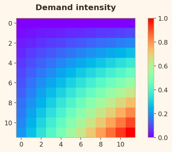
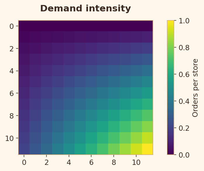
Rule 19 · Color map quality
Continuous color should use a perceptual scale and a labeled color bar.
Bad chart code
import matplotlib.pyplot as plt
import numpy as np

heat = np.outer(np.linspace(0, 1, 12), np.linspace(0.2, 1, 12))

fig, ax = plt.subplots(figsize=(6.4, 3.8))
image = ax.imshow(heat, cmap="rainbow")
ax.set_title("Demand intensity")
fig.colorbar(image, ax=ax)
plt.show()
Good chart code
import matplotlib.pyplot as plt
import numpy as np

heat = np.outer(np.linspace(0, 1, 12), np.linspace(0.2, 1, 12))

fig, ax = plt.subplots(figsize=(6.4, 3.8))
image = ax.imshow(heat, cmap="viridis")
ax.set_title("Demand intensity")
colorbar = fig.colorbar(image, ax=ax)
colorbar.set_label("Orders per store")
plt.show()
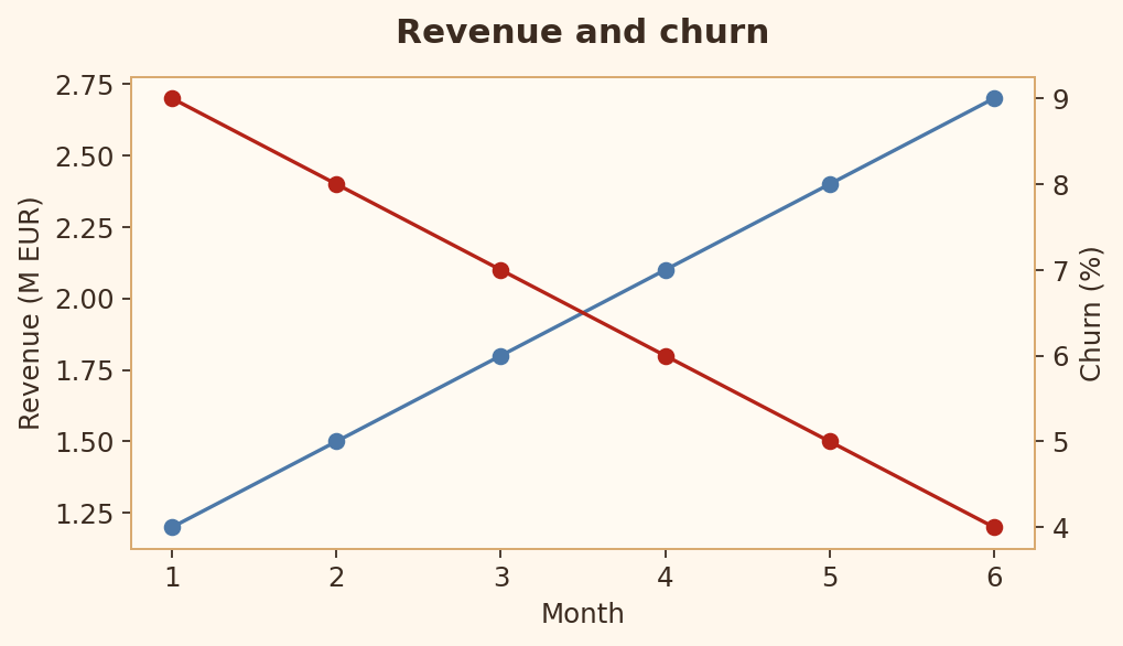
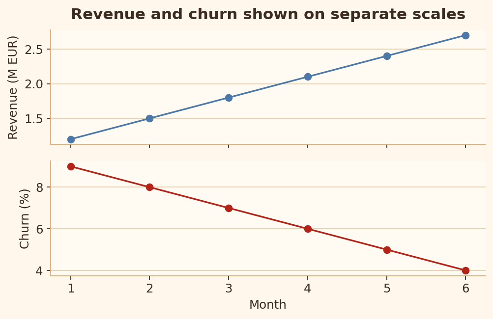
Rule 20 · Avoid dual axes
Dual axes can imply relationships that come from scale choices rather than data.
Bad chart code
import matplotlib.pyplot as plt

months = [1, 2, 3, 4, 5, 6]
revenue = [1.2, 1.5, 1.8, 2.1, 2.4, 2.7]
churn = [9, 8, 7, 6, 5, 4]

fig, ax1 = plt.subplots(figsize=(6.4, 3.8))
ax2 = ax1.twinx()
ax1.plot(months, revenue, marker="o", label="Revenue")
ax2.plot(months, churn, marker="o", color="red", label="Churn")
ax1.set_ylabel("Revenue (M EUR)")
ax2.set_ylabel("Churn (%)")
plt.show()
Good chart code
import matplotlib.pyplot as plt

months = [1, 2, 3, 4, 5, 6]
revenue = [1.2, 1.5, 1.8, 2.1, 2.4, 2.7]
churn = [9, 8, 7, 6, 5, 4]

fig, axes = plt.subplots(2, 1, figsize=(6.4, 4.2), sharex=True)
axes[0].plot(months, revenue, marker="o")
axes[0].set_ylabel("Revenue (M EUR)")
axes[1].plot(months, churn, marker="o", color="red")
axes[1].set_ylabel("Churn (%)")
axes[1].set_xlabel("Month")
plt.show()
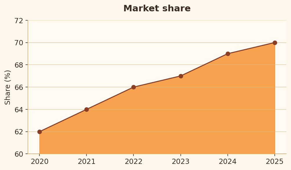
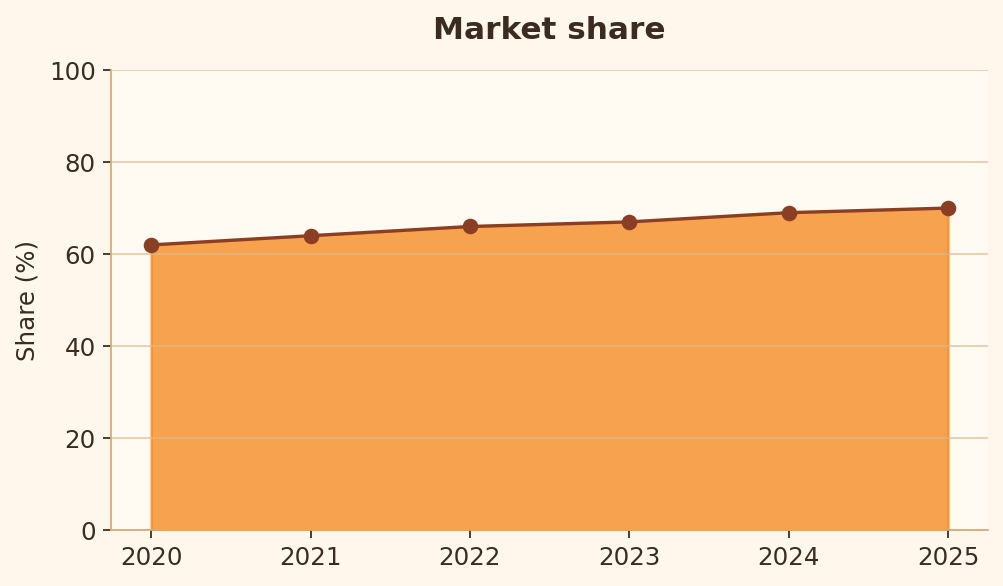
Rule 21 · Area baseline
Filled areas should use an honest baseline because area size carries meaning.
Bad chart code
import matplotlib.pyplot as plt

years = [2020, 2021, 2022, 2023, 2024, 2025]
share = [62, 64, 66, 67, 69, 70]

fig, ax = plt.subplots(figsize=(6.4, 3.8))
ax.fill_between(years, share, 60)
ax.plot(years, share, marker="o")
ax.set_ylim(60, 72)
ax.set_ylabel("Share (%)")
plt.show()
Good chart code
import matplotlib.pyplot as plt

years = [2020, 2021, 2022, 2023, 2024, 2025]
share = [62, 64, 66, 67, 69, 70]

fig, ax = plt.subplots(figsize=(6.4, 3.8))
ax.fill_between(years, share, 0)
ax.plot(years, share, marker="o")
ax.set_ylim(0, 100)
ax.set_ylabel("Share (%)")
plt.show()
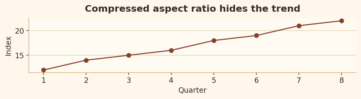
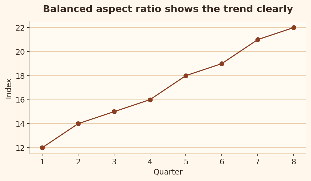
Rule 22 · Aspect ratio sanity
Extreme aspect ratios can flatten or exaggerate trends.
Bad chart code
import matplotlib.pyplot as plt

quarters = [1, 2, 3, 4, 5, 6, 7, 8]
index = [12, 14, 15, 16, 18, 19, 21, 22]

fig, ax = plt.subplots(figsize=(7.8, 2.2))
ax.plot(quarters, index, marker="o")
ax.set_title("Compressed aspect ratio hides the trend")
plt.show()
Good chart code
import matplotlib.pyplot as plt

quarters = [1, 2, 3, 4, 5, 6, 7, 8]
index = [12, 14, 15, 16, 18, 19, 21, 22]

fig, ax = plt.subplots(figsize=(6.4, 3.8))
ax.plot(quarters, index, marker="o")
ax.set_title("Balanced aspect ratio shows the trend clearly")
plt.show()
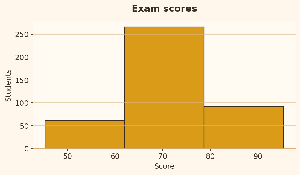
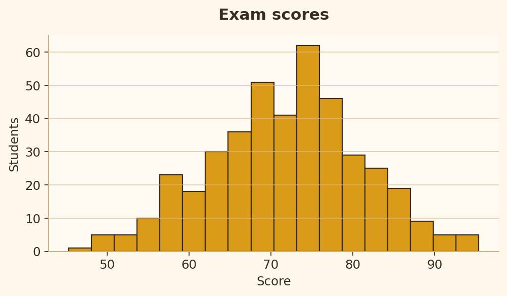
Rule 23 · Histogram bin quality
A histogram needs enough bins to reveal the distribution shape without creating noise.
Bad chart code
import matplotlib.pyplot as plt
import numpy as np

rng = np.random.default_rng(42)
scores = rng.normal(72, 9, 420)

fig, ax = plt.subplots(figsize=(6.4, 3.8))
ax.hist(scores, bins=3)
ax.set_title("Exam scores")
ax.set_xlabel("Score")
ax.set_ylabel("Students")
plt.show()
Good chart code
import matplotlib.pyplot as plt
import numpy as np

rng = np.random.default_rng(42)
scores = rng.normal(72, 9, 420)

fig, ax = plt.subplots(figsize=(6.4, 3.8))
ax.hist(scores, bins=18)
ax.set_title("Exam scores")
ax.set_xlabel("Score")
ax.set_ylabel("Students")
plt.show()
Rule 24 · Category color consistency
The same category should keep the same color throughout a chart.
Bad chart code
import matplotlib.pyplot as plt

quarters = ["Q1", "Q2", "Q3"]
desktop = [42, 45, 48]
mobile = [31, 34, 38]

fig, ax = plt.subplots(figsize=(6.4, 3.8))
ax.plot(quarters, desktop, marker="o", color="blue", label="Desktop")
ax.plot(quarters, mobile, marker="o", color="orange", label="Mobile")
ax.scatter(["Q2"], [45], color="orange", s=90)
ax.scatter(["Q2"], [34], color="blue", s=90)
ax.legend()
plt.show()
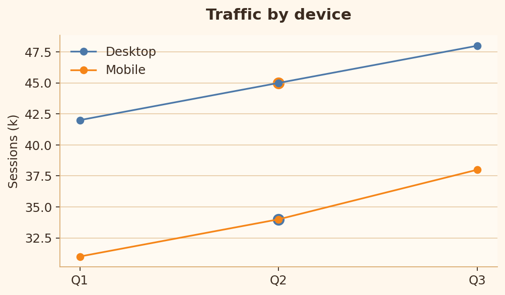
Good chart code
import matplotlib.pyplot as plt

quarters = ["Q1", "Q2", "Q3"]
desktop = [42, 45, 48]
mobile = [31, 34, 38]

fig, ax = plt.subplots(figsize=(6.4, 3.8))
ax.plot(quarters, desktop, marker="o", color="blue", label="Desktop")
ax.plot(quarters, mobile, marker="o", color="orange", label="Mobile")
ax.legend()
ax.set_title("Traffic by device")
ax.set_ylabel("Sessions (k)")
plt.show()
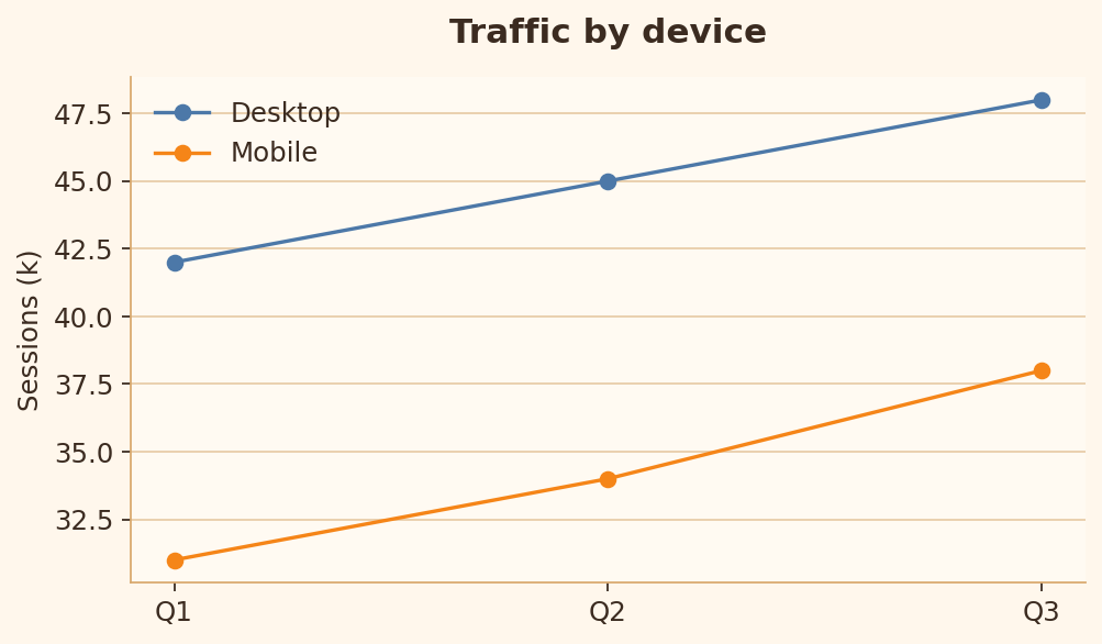
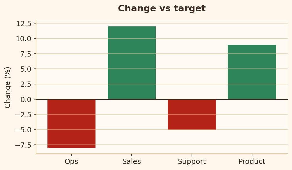
Rule 25 · Diverging zero reference
Positive and negative values need a clear zero reference.
Bad chart code
import matplotlib.pyplot as plt

departments = ["Ops", "Sales", "Support", "Product"]
delta = [-8, 12, -5, 9]

fig, ax = plt.subplots(figsize=(6.4, 3.8))
ax.bar(departments, delta)
ax.set_title("Change vs target")
ax.set_ylabel("Change (%)")
plt.show()
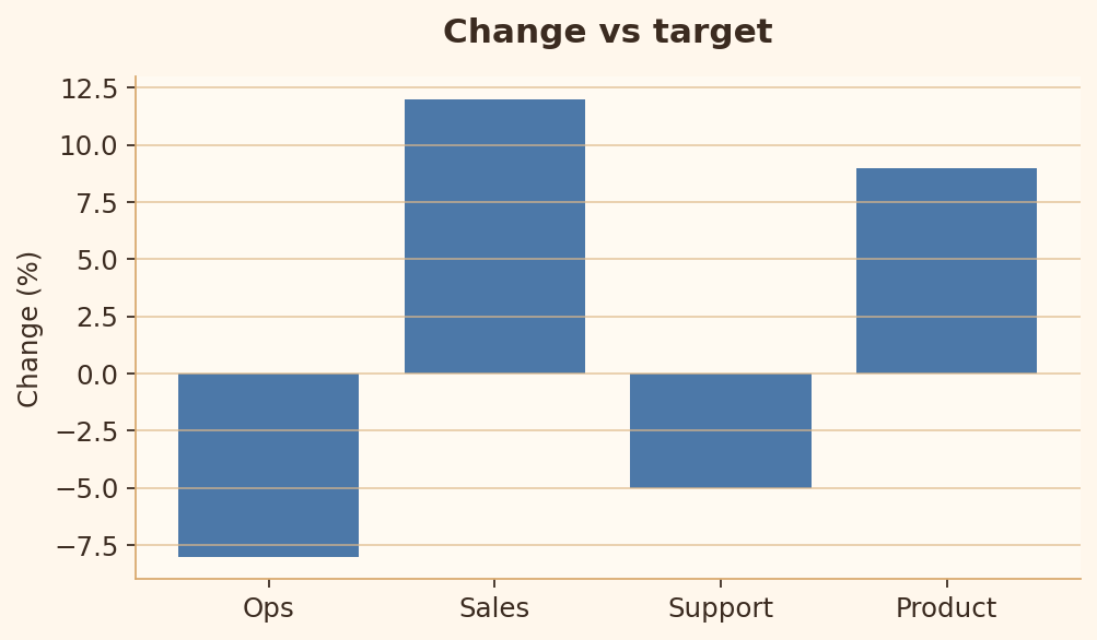
Good chart code
import matplotlib.pyplot as plt

departments = ["Ops", "Sales", "Support", "Product"]
delta = [-8, 12, -5, 9]
colors = ["#b42318" if value < 0 else "#2f855a" for value in delta]

fig, ax = plt.subplots(figsize=(6.4, 3.8))
ax.bar(departments, delta, color=colors)
ax.axhline(0, color="black", linewidth=1.2)
ax.set_title("Change vs target")
ax.set_ylabel("Change (%)")
plt.show()